

tired of being immapant
Well.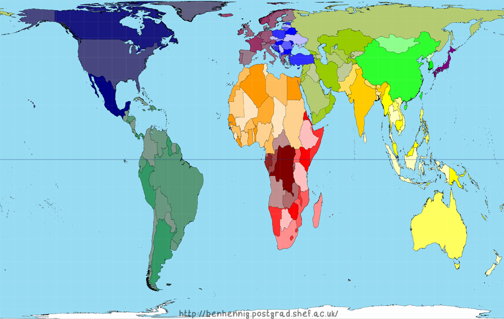
This is about immappancy <or being immapant>.
The concept of “immappancy”, meaning insufficient geographical knowledge … and the fact it is being driven by some inaccurate maps we constantly refer to … okay … not inaccurate but maybe simply misleading.
And to be honest … I will admit that I have been guilty of immapancy. In general an ignorant disregard for the truth of geography. But I am here to not only put my ignorance to rest but to enlighten at the same time.
I became aware of this issue in maybe 2001 <I am guessing>. One of my favorite scenes from one of my favorite shows, West Wing, had to do with ‘immappancy’ … or how maps mislead perceptions … and even create the wrong perceptions.
<I will get back to that episode later in the post>
Ok.
About maps <and the fact the ones we mostly grew up with do not accurately depict truth>.
Part of the issue we face when we look at traditional maps is something called ‘the Mercator projections.’ The illusion of Mercator projections, which show the Earth sphere on a flat surface while maintaining a line of constant bearing as a straight line, are useful for marine navigation, but they give us an inaccurate idea about the size and shape of continents.
< A sphere cannot be represented on a flat plane without distortion, which means all map projections distort in one way or another. Some projections show areas accurately but distort distances or scales, for example; others preserve the shapes of countries but misrepresent their areas>
Therefore … we are, for the majority, basically immapant <an expression kind of meaning “illiterate in map reading”>.
Now.
I will admit that it absolutely drives me nuts that in a place like the United States where people literally have access to information at their fingertips, most are still absolutely clueless about the world.
But I will also admit that it doesn’t help when every map you look at distorts truth.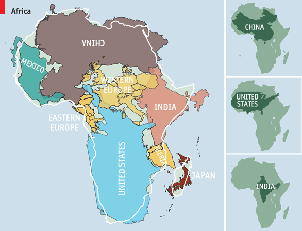
It helps understand what I am talking about because Kai Krause, a computer-graphics guru, created a map entitled “The True Size of Africa” which showed the outlines of other countries crammed into the outline of the African continent.
His aim was to make “a small contribution in the fight against rampant Immappancy” and address the fact that most people do not realize how much the ubiquitous Mercator projection distorts the relative sizes of countries.
All interesting … but what about that West Wing episode?
West Wing’s press secretary CJ Craig “freaked out” at the sight of a new view of the world. The show is fictional, but the map is fact. It is the Peters Projection World Map.
But.
Here is the scene from West Wing.
West Wing – Why are we changing maps?: http://www.youtube.com/watch?v=n8zBC2dvERM
Anyway.
What CJ Craig saw on WEST WING is a map commonly seen in Europe, Africa, Asia and Latin America although almost unheard of in North America … the Peters Projection map.
The countries look different from what we are used to seeing. In fact, the Peters Projection map shows all countries in their true size and proportion. One square inch on the map represents an equal number of square miles anywhere in the world. Peters Projection World maps are available in most book stores or directly from ODT, Inc. at 1-800-736-1293 To see all the Peters Equal Area Maps, click here.
The novelty of the Peters (or Gall-Peters projection) and other projections such as the Hobo-Dyer is that it is not focused in compass bearings like the Mercator projection <which many people consider obsolete but almost impossible to ‘re-align’ global education and knowledge around a revised map>. Instead these projections represent countries and continents in far more accurate proportions and, by so doing, reduce the distorted visual dominance of the Northern Hemisphere.
The Mercator projection dates from 1569, and its purpose was to provide navigational aid for nautical charts during the age of Europe’s explorations for alternative routes to Asia. The map preceded the colonial developments of later centuries, yet it accurately illustrated a superiority bias which dominated relations between European empires and their colonial territories across the world.
Regardless of the inaccurate Mercator proportions <the mistaken visual dominance of “developed countries” in the Northern hemisphere and the fact that neither North nor South (or up or down) exist in the universe … therefore highlighting the arbitrariness of cardinal points and their placement> and the fact it is the most widely used map … I truly wonder why more people do not understand some global truths <where countries are and proportionate sizes in population and land mass> even if the visual is inaccurate.
Anyway.
The Peters Projection map is in a class of map projections called equal-area maps. On the familiar Mercator projection, Greenland appears to be the same size as Africa. However Africa, at 11.6 million square miles, is really more than 14 times larger than Greenland at 0.8 million square miles. <“Explanation of the Peters Projection Map.”>
 Ok.
Ok.
As admitted upfront … I brought up immappancy because I was ignorant with regard to many of the things this mapping research uncovered.
And I know maybe 2 adults in ten can name more than 5 countries in Africa.
And I know maybe 2 in ten can even point out where a country like Israel is on a map … let alone some place like Turkey or <god forbid> Sweden or Norway.
It is embarrassing to ask people to locate countries on a map <and watch them struggle>.
We are in the information era where curiosity can be sated in but a moment.
Almost anything any one wants to know … they can find the answer by searching the internet.
In my mind there is no longer an excuse for why people know so little of the world … even if the maps we typically look at are out of whack.
Leave a Comment